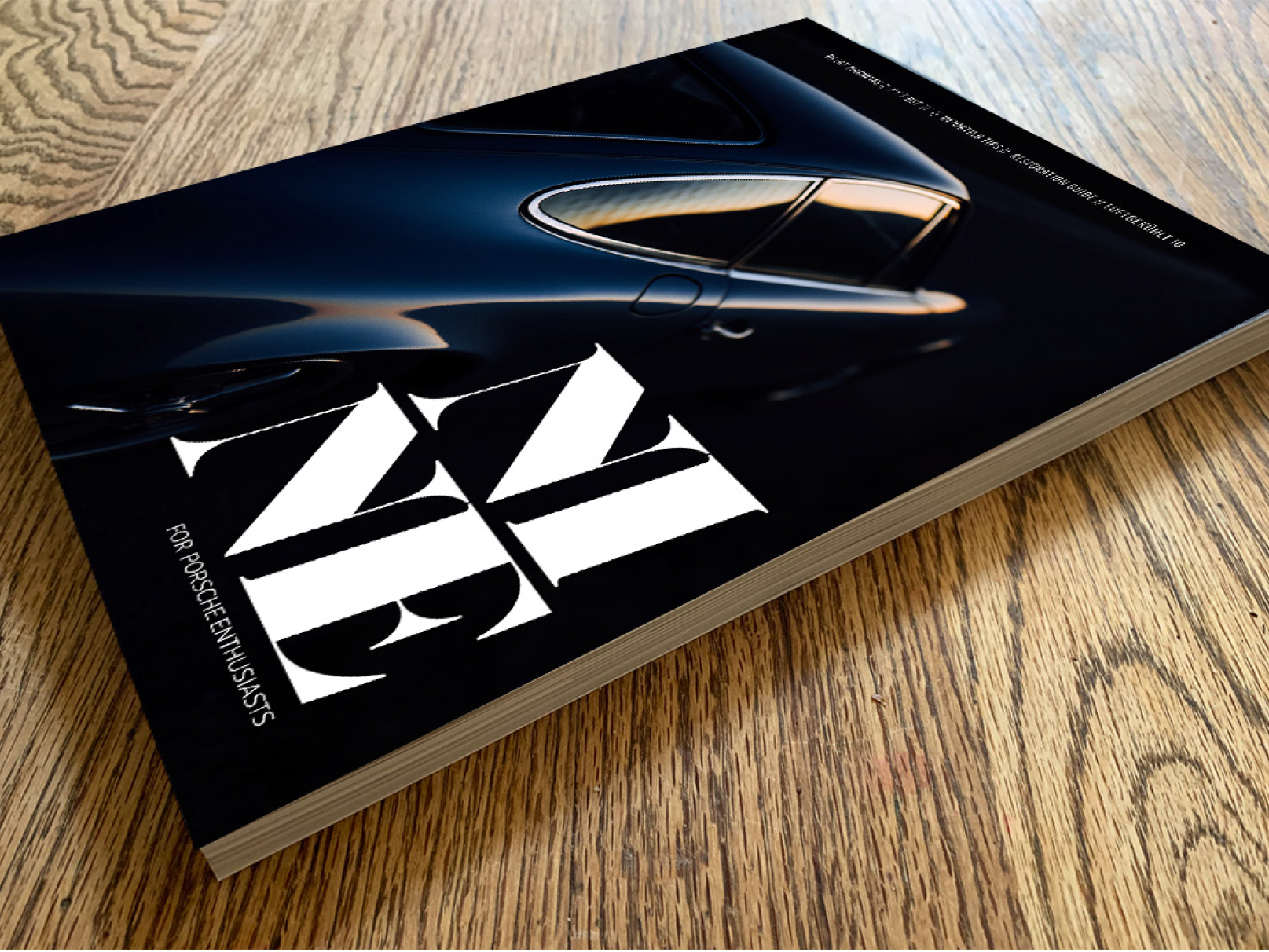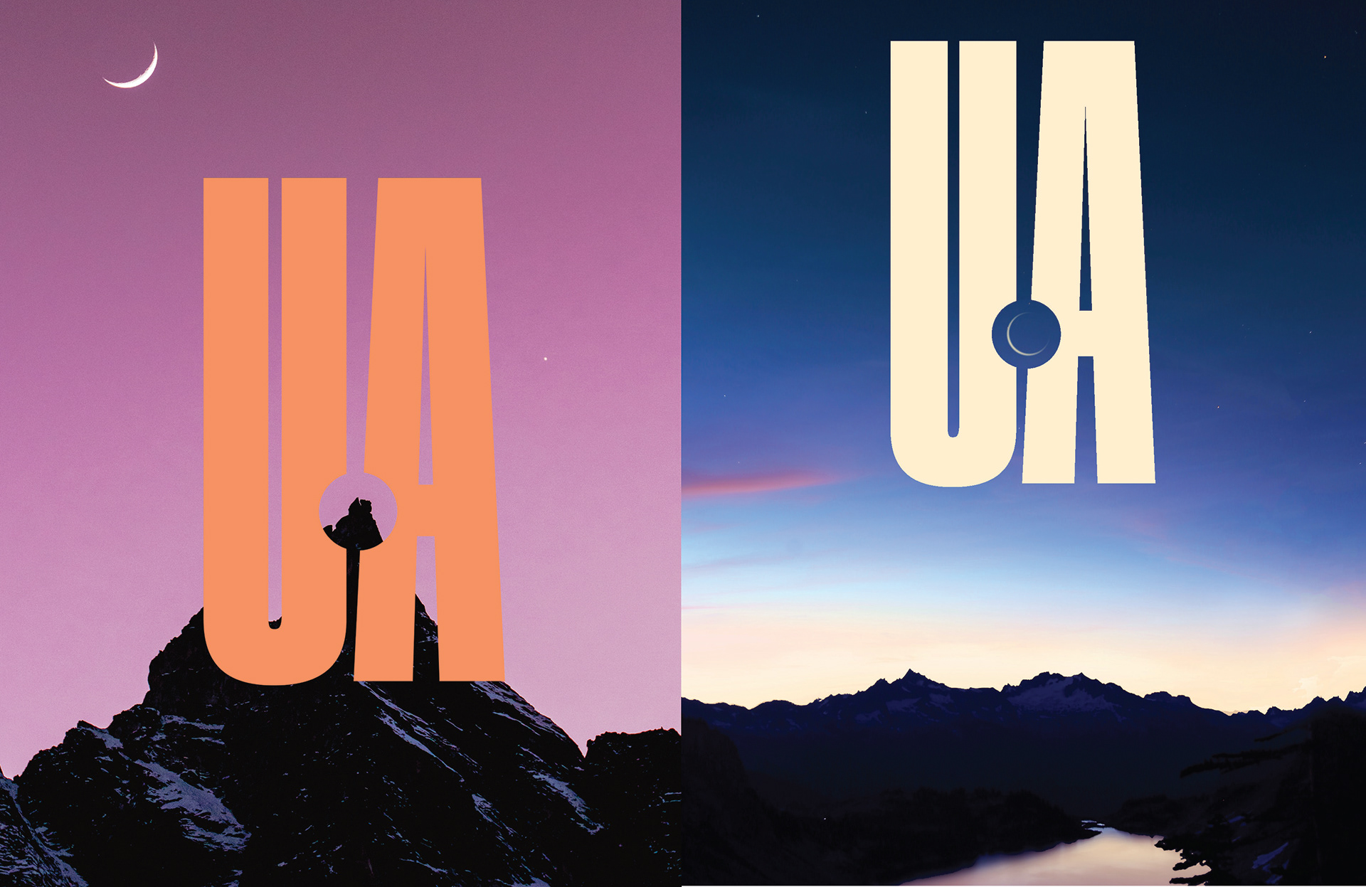
The challenge was to come up with a logo and identity for a new outdoor exploration and film-making company. The work would have to convey a lot, in a moment. So an imposing narrow sans font was used, with a perfect circle removed, to symbolize the camera lens. This also utilizes the logo as a framing mechanism, allowing it to interact with and emphasize the background and the natural world.